A survey was conducted at a Cafe which sells food and coffees.
The reason for the survey was that they were having trouble keeping up with the demand for Cappuccino coffees during peak periods.
The Barista suggested that they get a bigger machine to cope with the high demand.
A bigger machine is very expensive to buy, and so the owner had a two day survey done to find out how many Cappuccinos were being made per hour in the Cafe.
From the survey results, they would be able to do some Graphs and Statistics, and better understand the current problem situation.
Gathering and Analysing Statistical Data is a key part of Business and Marketing, and provides a mathematical picture of current situations and future initiatives.
In this lesson we look at finding the Mean, Median, and Mode Averages for Grouped Data containing Class Intervals.
If you do not have any previous knowledge of Mean, Median, and Mode, then we suggest you do our previous lesson on this at the following link:
http://passyworldofmathematics.com/averages-mean-median-mode/
If you do not have any previous knowledge of Grouped Data, then we suggest you do our previous lesson on this at the following link:
http://passyworldofmathematics.com/grouped-data-histograms/
One final thing to note before starting this lesson is that in Australia, we refer to subgroups of data as “Intervals” or “Class Intervals” or “Classes”; whereas some other countries call these groups “Bins”.
So whenever we say “Interval”, we mean the same thing as a “Bin”.
Grouped Data Histogram
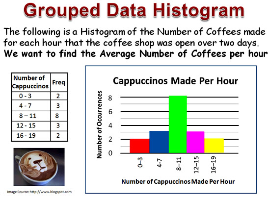
Image Copyright 2013 by Passy’s World of Mathematics
The Histogram shows an even spread of data, indicating that sometimes the Coffee Shop is very busy, while other times they are making less than eight cappuccinos per hour.
We now want to find the Average Number of Cappuccinos made every hour.
There are three types of Averages: the Mean, the Median, and the Mode.
In this lesson we calculate all three of these averages for the coffee shop example.
Finding the Range
The “Range” is the easiest Statistic to determine for Grouped Data.
We simply take the end of the Highest Interval, and subtract the Beginning of the first Interval.
Range = Maximium – Minimum
For our Coffee Statistics, the Highest Group is 16-19, so our High Value “Maximum” is 19.
The Lowest Group is 0-3, so the Low Value “Minimum” is zero.
Range = Maximium – Minimum = 19 – 0 = 19
The Range can also be stated as “0 to 19”
The Modal Class
The “Mode” is what happens most of the time, or on most occassions.
The “Mode” is the simplest Grouped Average to find.
It can be read straight from the Frequency Table, or straight from the Graph.
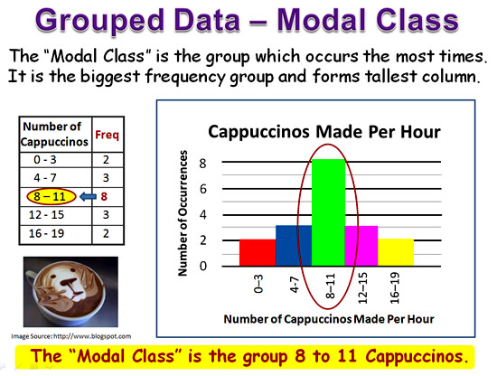
Image Copyright 2013 by Passy’s World of Mathematics
Sometimes we have more than one Group which is the most popular.
In these situations, we can have a two modes or a “Bimodal” situation, or three modes which is called “Trimodal”.
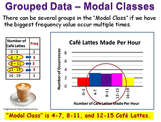
Image Copyright 2013 by Passy’s World of Mathematics
The Median Class
Finding the Median Class involves some working out steps to be applied to our original Frequency Table.
There are three Main Steps:
1) Finding the half-way midpoint in the Frequency values
2) Adding a third column to our Frequency Table where we calculate “Cumulative Frequency” values
3) Locating the half-way point in the Cumulative Frequency Column, and then seeing which Class Interval lines up with this half-way point.
How we do each of these steps is as follows.
There are two ways to find the half-way midpoint in the Frequency values.
We can either write out the numbers from 1 to the Total frequency value and manually find the middle; or we can use a simple math formula to find this value.
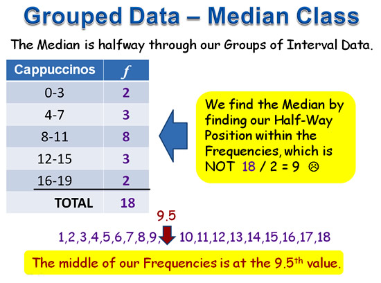
Image Copyright 2013 by Passy’s World of Mathematics
Rather than writing out a long list of numbers, It is much easier to use the formula: Middle = Total Frequency + 1 and then divide by 2.
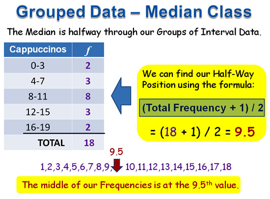
Image Copyright 2013 by Passy’s World of Mathematics
Once we have the half-way point, the next step is to do “Cumulative Addition” of the Frequencies.
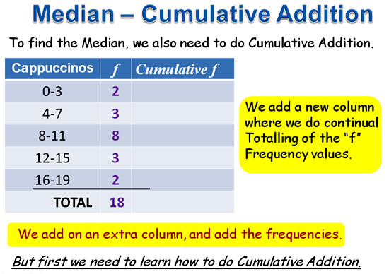
Image Copyright 2013 by Passy’s World of Mathematics
The following real world example shows how we do “Cumulative Addition”.
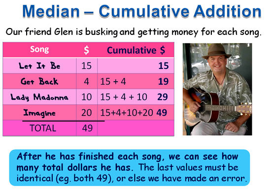
Image Copyright 2013 by Passy’s World of Mathematics
A Quicker way to get the “Cumulative” values is to use the “Zig Zag Adding Method”.

Image Copyright 2013 by Passy’s World of Mathematics
If you would like to check out some of Glenn’s music, then visit his website at the link below:
Here is how we apply “Cumulative Addition” to Finding the Median Class.
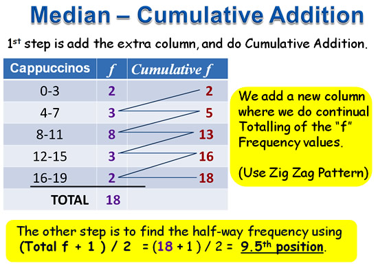
Image Copyright 2013 by Passy’s World of Mathematics
Here is the complete working out for the Median Class, which turns out to be the Interval group “8-11”.
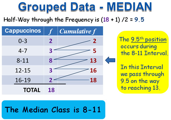
Image Copyright 2013 by Passy’s World of Mathematics
The MEAN Average for Grouped Data
Finding the MEAN involves more working out than finding the Modal Class and Median Class.
To find the MEAN (or “Mathematically Estimated Average Number”), involves adding two extra columns to our original Frequency Table.
There are three main steps:
1) Find all of our Interval Midpoints, and write these in the third column
2a) Multiply each Frequency x Midpoint value and put the answer each time into the fourth column
2b) Find the Total of the fourth column, eg. Total of Frequency x Midpoints
3) Apply the Formula: Grouped MEAN = ( Total of Frequency x Midpoints ) divided by Total Frequency
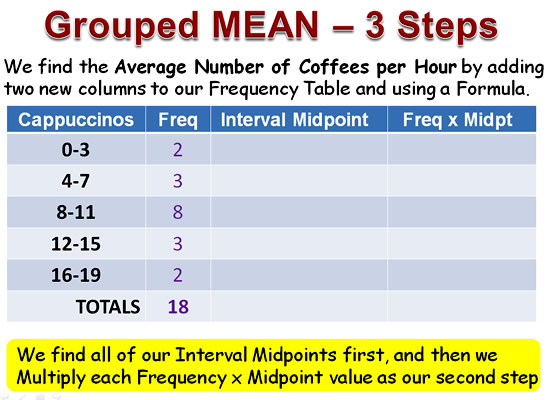
Image Copyright 2013 by Passy’s World of Mathematics
The first step is to find all of the Interval Midpoints.
There are two ways of doing step one: we can write each interval out as a list of numbers, or we can use a simple math formula to find the Midpoint.
Use whichever method you find easier to work with, they both give the same result.
Here is how we do the list of numbers method

Image Copyright 2013 by Passy’s World of Mathematics
To use the Midpoint Formula, add together the low and high values and divide each answer by two:
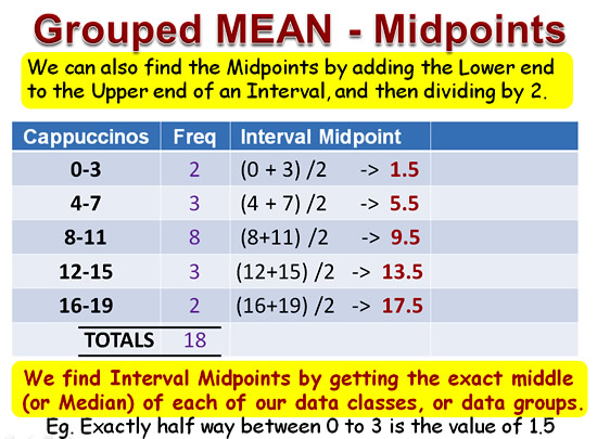
Image Copyright 2013 by Passy’s World of Mathematics
The second step on the way to finding the Grouped MEAN estimated average is to complete the final column of our table.
This involves multiplying each Midpoint by its Interval’s Frequency.
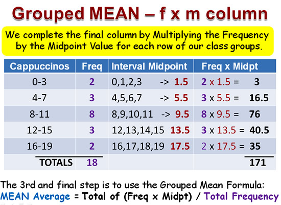
Image Copyright 2013 by Passy’s World of Mathematics
The third and final step is to apply the Grouped Mean Formula:
MEAN Average = Total of (Freq x Midpt) / Total Frequency
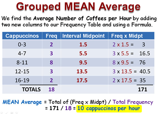
Image Copyright 2013 by Passy’s World of Mathematics
Mathematical Notation for MEAN
Our example of the MEAN calculation has working out steps written into the table.
These steps are usually not shown, once people are good at finding the MEAN.
There are also some special mathematical symbols used for the MEAN formula, which are as follows:
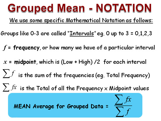
Image Copyright 2013 by Passy’s World of Mathematics
Our previous example worked out using correct mathematical notation looks like this:
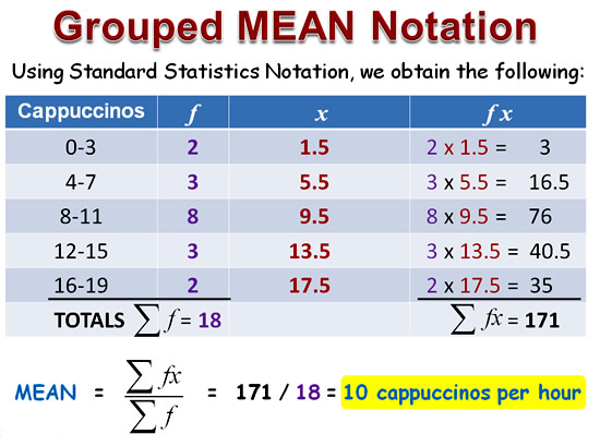
Image Copyright 2013 by Passy’s World of Mathematics
Coffee Shop Conclusion

Image Copyright 2013 by Passy’s World of Mathematics
The Histogram Graph shows that around one quarter of the time the Cafe is very busy making Cappuccinos, but the other one quarter of the time they are not very busy at all.
The calculated Averages, (Mean Median and Mode), indicate that on average they are making 8 to 11 Cappuccinos per hour, which along with their other coffee offerings should be manageable.
There does not seem to be enough demand overall for Cappuccinos to justify buying a bigger coffee machine at this stage.
Videos about Grouped Mean Median and Mode
This first video is Part 1 of 2, and it shows how to find the median and mode for grouped data.
This next video is Part 2, and shows how to find the MEAN for grouped data.
The first 7 minutes of the following video shows how to calculate the Mean Average for Grouped Data.
This final video shows how to find Mean Median and Mode.
Worked Examples for Grouped Mean Median Mode
The following link is to the BBC Bitesize lesson on Grouped Data Averages.
Click here for BBC Bitesize Lesson and Examples
This next link is to a PDF document containing worked examples.
Click here for PDF of Worked mean median mode Examples
TI-83 and TI-84 Calculator Examples
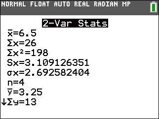
Image Source: http://education.ti.com
The following link gives step by step instructions on how to use a Texas Intruments Calculator to find the Mean, Median, and Mode, of Grouped Data.
http://mathbits.com/MathBits/TISection/Statistics1/MMMgrouped.htm
Related Items
Stem and Leaf Plots
Back to Back Stem and leaf Plots
Mean Median Mode of Ungrouped Data
Mean Median Mode and MS Excel
Grouped Data Histogram Graphs
Symmetry and Skew
Basic Histogram Graphs
MS Excel Charts and Graphs
MS Excel Column Graphs and Pie Charts
Funny Graphs from Graph Jam
Misleading Graphs
Real Life Graphs
Free Online Graph Makers
Subscribe
If you enjoyed this lesson, why not get a free subscription to our website.
You can then receive notifications of new pages directly to your email address.
Go to the subscribe area on the right hand sidebar, fill in your email address and then click the “Subscribe” button.
To find out exactly how free subscription works, click the following link:
If you would like to submit an idea for an article, or be a guest writer on our website, then please email us at the hotmail address shown in the right hand side bar of this page.
If you are a subscriber to Passy’s World of Mathematics, and would like to receive a free PowerPoint version of this lesson, that is 100% free to you as a Subscriber, then email us at the following address:
Please state in your email that you wish to obtain the free subscriber copy of the “Grouped Data Mean Median Mode” Powerpoint.
Feel free to link to any of our Lessons, share them on social networking sites, or use them on Learning Management Systems in Schools.
Like Us on Facebook
Our Facebook page has many additional items which are not posted to this website.
These include items of mathematical interest, funny math pictures and cartoons, as well as occassional glimpses into the personal life of “Passy”.
Check it out at the following link:
https://www.facebook.com/PassysWorldOfMathematics
While you are there, LIKE the page so you can receieve our FB updates to your Facebook News Feed.
Help Passy’s World Grow
Each day Passy’s World provides hundreds of people with mathematics lessons free of charge.
Help us to maintain this free service and keep it growing.
Donate any amount from $2 upwards through PayPal by clicking the PayPal image below. Thank you!
PayPal does accept Credit Cards, but you will have to supply an email address and password so that PayPal can create a PayPal account for you to process the transaction through. There will be no processing fee charged to you by this action, as PayPal deducts a fee from your donation before it reaches Passy’s World.
Enjoy,
Passy




Pingback: Grouped Data Histograms | Passy's World of Mathematics
Pingback: Basic Histogram Graphs | Passy's World of Mathematics
Pingback: Symmetry and Skew | Passy's World of Mathematics
Pingback: Back to Back Stem and Leaf Plots | Passy's World of Mathematics