

Microsoft Excel is great for making Charts and Graphs. However we can also use some free Graph makers on the Internet for doing most of the basic graphs we need for mathematics.
In this lesson we look at How to use “Kids Zone” and “Chart Go” to make a simple Bar Chart for a Shoe Length survey, as well as a Pie Chart for a Car Colour Survey.
We then look at more great free online graph makers for Stem and Leaf Plots, Box and Whisker Plots, Histograms, Scatter Plots, Straight Line Graphs, Quadratics, Parabolas, Cubics, and Trigonometry Functions.
Here at Passy World two of our favorite free online graph makers are:
“Kids Zone Make a Graph” at:
http://nces.ed.gov/nceskids/createagraph/default.aspx
and
“Chart Go” at:
If we need to do a Pie Chart, there is also the “Math Warehouse Pie Chart Maker” at:
http://chartmaker.mathwarehouse.com/create-pie-chart/
Apart from these three, there do not seem to be any other free chart making applications around on the web at the moment that are better for making Bar Charts and Pie Graphs.
Bar Chart Using Kids Zone
The Data we need to graph is a Shoe Length Survey which was done in our mathematics class, with results as follows:

First we need to go the the Kids Zone website by clicking the following link:
http://nces.ed.gov/nceskids/createagraph/default.aspx
Next we click which type of graph we want to work on, such as Bar Chart:

This takes us to the Design tab screen, where we can set up the following for our bar graph:

The best way to explain the above settings is that people need to try making changes to the settings, by coming back to this tab when they have completed the graph to see the exact effect that changing each setting has.
It is important to set the “Grid Lines” to a number which will enable us later to have a vertical scale in ones, rather than inbetween decimal values.
Down the right hand side of the app, there are several Tabs which we work down in order from top to bottom, to make our completed graph.
The great thing about this process, is that we can click the update button at any time to save our work.
The even greater thing is that we can go back to any previous tab at any time, make adjustments, and then re-update and preview our graph.
We now proceed to the next tab down, which is “Data”, and here we set up our values and the colour that we want the bars to be.

Note that the maximum and minimum values we have set are 0 and 10, because we set eleven grid lines back on the Design screen.
0 to 10 is eleven values, (count them on your fingers), and this means with eleven grid lines we should get a vertical scale on our completed graph that goes in ones.
The next tab we complete is the “Labels” tab.

On this screen we have set “show labels” to “No”, which means there will not be any numbers place above individual bars saying how high they each are.
If you like having each bar labeled at the top with its height value, then set this “labels” option to “Yes”.
We are now ready to check how our completed Graph will look, which we do by clicking on the “Preview” tab.

Checking our completed graph, we noticed that we forgot to put down anywhere that the show length was measured in centimeters, cm.
This is not a problem, as we simply go click on the “Data” tab to go back to the horizontal x-axis Label box and change it to “Shoe Length in cm”.
We then click “Update” at the bottom of the screen, and the “Preview” tab so we can recheck our completed graph:

Finally we are ready to save or print our graph, and so we click on this last tab.

We like to use the download option, and there are several different ways to save our graph, which we access by clicking the drop down menu button.

The size of our saved JPG was 600×453 pixels in size, and of very good image quality.
After one save, we can also re-save in another format if we want to.
On the Download tab there is also an option where students can email completed graphs to their teacher.
Here is a YouTube video which will recap the steps we have performed to make our Bar Graph.
[youtube http://www.youtube.com/watch?v=DGTQlzNchPU]
That’s it for our Kid’s Zone Bar Chart. This graph maker is very popular with our mathematics students, and probably our favorite free online graphing app here at Passy World.
Bar Chart Using Chart Go
“Chart Go” is another good free online graphing application which can be found at the following link:
http://www.chartgo.com/
We will now draw the same Bar Chart as we did for Kids Zone: the “Shoe Length Survey”.
On the first “Chart Go” screen, we set up all of our data as shown below.

We then click the bottom of page “Create Chart” button.

After we click the “Create Chart” button we get our graph.
If we click on “Modify This Chart” we can go back and redo items on the data entry opening screen.
If we right click with our mouse on the graph, we can do a “Save As” and save a picture of our graph.
Here is the final saved picture of our “Chart Go” bar chart.
Kids Zone Pie Chart
We can also make Pie Charts and Line Graphs with the “Create a Graph” Application.
Here is the frequency table for a Car Park Survey we carried out recently.

Using the Kid’s Zone “Create a Graph” free online application, here is the resulting Pie Chart.

The nice thing about Kid’s Zone is that we can pick the colour of each piece of pie. So we made them match the car colour.
Chart Go Pie Chart
We can also make Pie Charts and Line Graphs with the “Chart Go” Application.
We used the same frequency table for a Car Park Survey we carried out recently.
Using the “Chart Go” free online application, here is the resulting Pie Chart.

Math Warehouse Pie Chart Maker

Maths Warehouse have a Pie Chart Maker at this link:
http://chartmaker.mathwarehouse.com/create-pie-chart/
The screens on this free online Pie Chart maker take us through step by step to make the chart.
For the colors of the pieces, we had to choose a premade color scheme and could not individually choose our own colors.
Quite a few of the colour schemes have white, which does not work very well if we use a white background, so we need to change Background colour on these.
The biggest problem is that once the chart is made, there does not seem to be any way to go back and edit it; unlike “Chart Go” or “Kids Zone” which both allow as much re-tweaking as you like.
Straight Line and Parabola Graphs
There is a great straight line plotter at the following link:
http://webgraphing.com/plotting_basic.jsp#
The setup is a calculator where we enter our line’s equation, and then set a range for the x and y axis values.
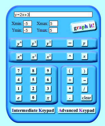
We then click the “Graph It” button, and get an (x,y) values table produced, as well as the graph.

With the graph plotted for us as well.
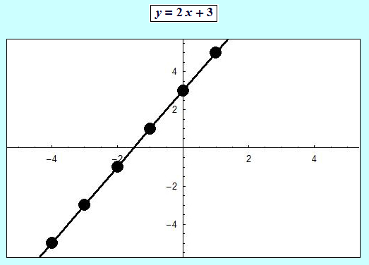
This graphs plotter is great because it is so simple to use, and has buttons for x squared and so on.
It can also do parabolas and cubics. When we mouse over these plotted output graphs it gives us a smooth curve line of best fit, which is very impressive.
There is another excellent equation plotter at the following link:
http://rechneronline.de/function-graphs/
This has a lot of setup options, but the best approach is to enter your equation, graph it, and then adjust the other values if necessary.
It can do Straight Lines, Parabolas, and other functions.
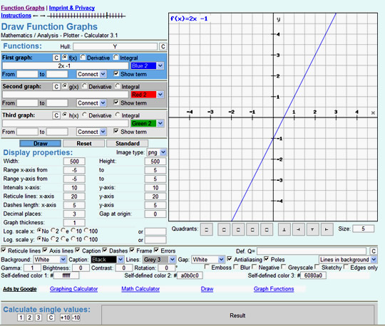
A very similar version of this graph maker can be found at the following link:
http://graph-plotter.cours-de-math.eu/
Straight Line Between Two Points

All we have to do is enter the (x,y) coordinates of any two points and click “Go” and this online interactive will calculate the slope, find the rule for the line, and even plot the line for us on an X-Y Grid.
It also tells us about Parallel and Perpendicular Lines.
Click the following link to use this interactive.
http://www.mathsisfun.com/straight-line-graph-calculate.html
Interactive Straight Line Graph
The following interactive demonstration is great for showing students how changing the “m” and “c” values affects the Gradient and Y-intercept position of the resulting Straight Line Graph.
Simply adjust the sliders alongside the graph to change the effect.
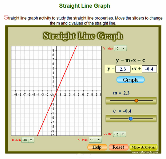
To use this free interactive online, click the following link:
http://www.softschools.com/math/algebra_1/straight_line_graph/
Interactive Parabola
The following interactive demonstration is great for showing students how changing the coefficients and constants affects the position and shape of the resulting Parabola Graph.
Simply adjust the sliders alongside the graph to change the effect.

To use this free interactive online, click the following link:
http://www.softschools.com/math/algebra_1/quadratic_equation_graph/
Online Stem and Leaf Maker

The above online Stem and Leaf maker is from Mr Nussbaum’s web site.
Put the item values in one by one, which is a bit slow, and then when ready click “Create Graph”.
This online maker only does Groups of Ten S&L Plots.
It also does not include “empty” stems, which have no data values in their range.
Click the following link to use this free S&L maker.
http://www.mrnussbaum.com/graph/sl.htm
Advanced Online Stem and Leaf Maker

This S&L maker does Mean, Median etc, and if we tick the box “Split Stems in Two”, it even does a Groups of Five stem and leaf plot.
The example S&L Plot shown above is a Groups of Five Plot.
Click the following link to use this free S&L maker.
http://www.calculatorsoup.com/calculators/statistics/stemleaf.php
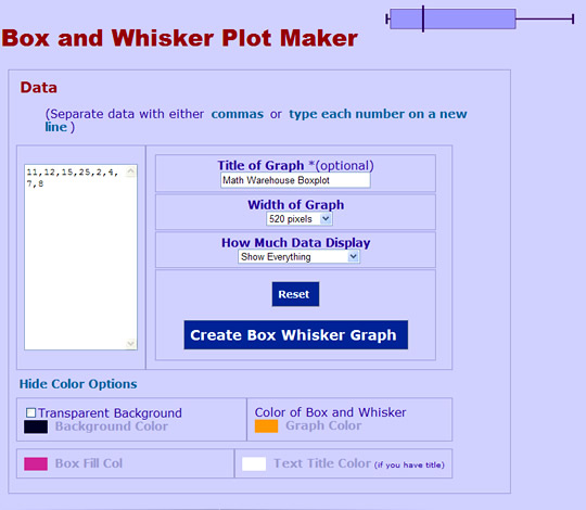
Box and Whisker Plots
Math Warehouse has a very nice free Box and Whisker Plot maker at the following link:
http://www.mathwarehouse.com/charts/box-and-whisker-plot-maker.php#boxwhiskergraph
The setup is easy to do, and we can also pick from a great range of colors to use for our chart.
Here is the generated Box and Whisker Plot:
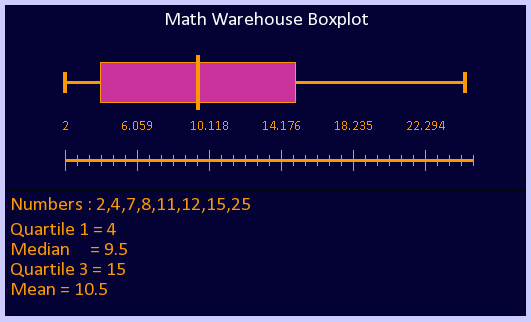
The only strange thing about the plot is the ruler scale being generated with rather obscure decimal values, rather than in whole numbers.
Nice features are that we can keep going back and changing colors, data, and options, and redraw our Box Plot as many times as we like.
When we are finished, there is a bright green download arrow that enables the chart to be saved as a GIF picture file onto our computer.
There is another free online Box and Whisker Plot maker at the following link:
http://www.alcula.com/calculators/statistics/box-plot/
However, this one generates a vertical box, and does not have the color features of Maths Warehouse.
Histograms
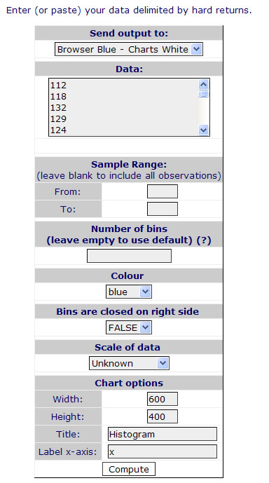
There is a great free Histogram maker at the following link:
http://www.wessa.net/rwasp_histogram.wasp/
Entering the data is easy, as shown below.
Note that “Bins” are an American term referring to “Class Intervals”.
After we click the “Compute” button, and scroll down, the first output of a full frequency table that includes relative cumulative frequency as well, (which could be used to create an Ogive graph from, but the plotter does not do this).
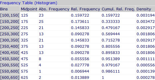
Then scrolling down further from here we get our Histogram Graph.
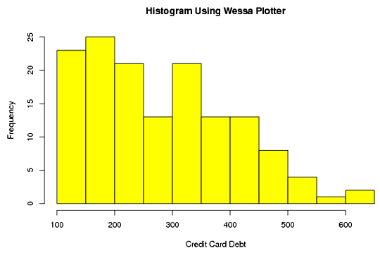
There does not appear to be any facility to save the generated Histogram, and so we need to “Print Screen” capture it into a document to save it permanently.
Another thing to watch out for is that once we generate a Histogram, it does not seem to save our titles and headings back in the data input section, and so we cannot repeatedly generate graphs without typing some of this information back in.
The “Wessa” site also has a great free online range of more advanced Statistics Plotters and Analysis tools.
Check out their main page at the link below:
http://www.wessa.net/stat.wasp
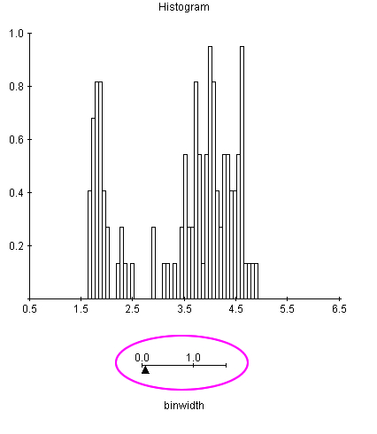
Histogram Interval Width Interactive
The following interactive demonstration is great for showing students how changing the “Bin Size” or “Class Interval Width” affects the number of resulting columns on a Histogram.
Simply adjust the slider below the graph to change the effect.
Eg. Narrow Intervals or Bins gives too many columns:
Having wider Intervals or Bins in the grouped data creates less columns, and makes a far more readable graph.
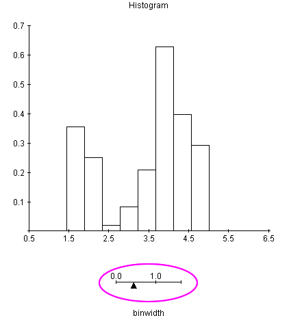
To use this free interactive online, click the following link:
http://www.stat.sc.edu/~west/javahtml/Histogram.html
Ogive Cumulative Frequency Graph

Image Source: http://inhabitat.com/
Ogives are “S-shaped” graphs, like the shape of the roof on this energy efficient solar studio.
We have not been able to find a good free online Ogive Plotter, but we did find a Histogram generator which gives a cumulative frequency table at the following link:
http://www.wessa.net/rwasp_histogram.wasp/
Microsoft Excel is probably the best available computing tool if you need to create an Ogive Graph of cumulative frequency.
The following is a great YouTube video on how to use Microsoft Excel to create a Histogram with an Ogive line over the top of it
Scatter Plot
There is a very good free Scatter plotter at the following site:
http://www.mathcracker.com/scatter_plot.php
Input of data is very simple.
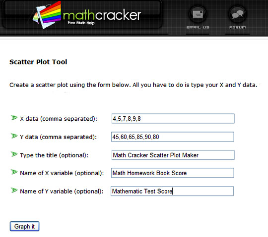
Then we simply click the “Graph It” button to obtain our plot.
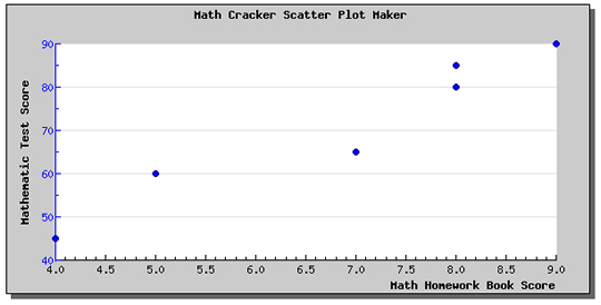
The only drawback to this plotter is that it does not draw or supply an equation for the line of best fit, or the “r” value correlation coefficient.
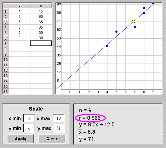
The following free Scatter Plotter does supply the “r” correlation coefficient value:
http://nlvm.usu.edu/en/nav/frames_asid_144_g_4_t_5.html?open=activities
Here is the same data as previously made above.
Venn Diagram Maker
It is not easy to find any of these which generate the diagrams online.
Most are downloadable applications, which may or may not be limited to a trial version only.
It is probably best to make your own circle diagrams in Microsoft Word, PowerPoint, Paint, or Photoshop.
However, the following free online generator does makes a basic two circle diagram at this link:
http://jura.wi.mit.edu/bioc/tools/venn.php
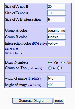
We simply enter our data like this:
Click the “Generate Diagram” button, and obtain the following results.
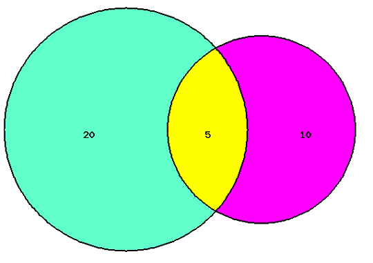
We can right click in our browser and save this image onto our own computer.
Advanced Online Graphs

The above online calculator can draw graphs with up to four different variables input.
As shown above, we enter a Quadratic Parabola in the form: x*x + 2*x + 1
http://www.mathopenref.com/graphfunctions.html
Review of Online Chart Makers
If the following page stalls on Internet Explorer, then wait a minute or two, and then click the stop script running pop up box.
The Hong Kiat blog has a review of 22 different online chart makers, but several of these are for web designers, and involve using HTML code.
http://www.hongkiat.com/blog/22-useful-chart-graph-diagram-generators/
Google Chart Makers

“Google Chart Tools” makes very nice interactive mouse-over graphs for web pages. For example, mouse over the graph below, and information should pop up for each of the pieces of pie.
http://code.google.com/apis/chart/interactive/docs/gallery.html
It is easiest to use the Gallery designs, and the HTML code can modified, and then cut and pasted into your website pages or Google Blogger directly. It should run the HTML and Javascript okay, and we get a really nice interactive graph that we can mouse over.
This approach will probably not work on Edublogs or Free WordPress blogs, as we believe these applications do not allow the running of Java script.
Find out more about Google HTML Java Chart Maker at the link below.
http://passyworldofict.blogspot.com.au/2012/03/google-charts-interactive-graphs.html
However this is probably not a chart maker that maths students doing graphing exercises will find useful.
“Google Chart Generator” is a different product. It runs online and makes very basic shades of one colour charts quickly, but there is no facility to label them with data values. It only does the general shape of the chart or graph.
http://www.heavytrader.it/google-chart-generator.php
Please note that Passy’s World of Mathematics has no financial interest in any of the websites reviewed in this lesson.
Related Items
Basic Histogram Graphs
Grouped Data Histograms Using Class Intervals
MS Excel Charts and Graphs
MS Excel Column Graphs and Pie Charts
Funny Graphs from Graph Jam
Real World Line Graphs
Averages – Mean Median Mode (including MS Excel)
Misleading Graphs
Stem and Leaf Plots (Stem Plots)
Real World Charts and Graphs
Free Online Math Tests
Free Online Math Videos
Free Online Math Worksheets
Free Online Calculators and Converters
GeoGebra Online Interactives and Demonstrations
Mathwarehouse Interactives
Microsoft Mathematics Free App for Windows PC
My Virtual Home
If you enjoyed this post, why not get a free subscription to our website.
You can then receive notifications of new pages directly to your email address.
Go to the subscribe area on the right hand sidebar, fill in your email address and then click the “Subscribe” button.
To find out exactly how free subscription works, click the following link:
If you would like to submit an idea for an article, or be a guest writer on our blog, then please email us at the hotmail address shown in the right hand side bar of this page.

If you are a subscriber to Passy’s World of Mathematics, and would like to receive a free PowerPoint version of this lesson, then email us at the following address:

Please state in your email that you wish to obtain the free subscriber copy of the “Online Graph Makers” Powerpoint.
Like Us on Facebook
Our Facebook page has many additional items which are not posted to this website.
These include items of mathematical interest, funny math pictures and cartoons, as well as occassional glimpses into the personal life of “Passy”.
Check it out at the following link:
https://www.facebook.com/PassysWorldOfMathematics
While you are there, LIKE the page so you can receieve our FB updates to your Facebook News Feed.
Help Passy’s World Grow
Each day Passy’s World provides hundreds of people with mathematics lessons free of charge.
Help us to maintain this free service and keep it growing.
Donate any amount from $2 upwards through PayPal by clicking the PayPal image below. Thank you!
PayPal does accept Credit Cards, but you will have to supply an email address and password so that PayPal can create a PayPal account for you to process the transaction through. There will be no processing fee charged to you by this action, as PayPal deducts a fee from your donation before it reaches Passy’s World.
Enjoy,
Passy


Pingback: Misleading Graphs | Passy's World of Mathematics
Pingback: Stem and Leaf Plots | Passy's World of Mathematics
Pingback: Real World Charts and Graphs | Passy's World of Mathematics
Pingback: Misleading Graphs | Passy's World of Mathematics
Pingback: Free Math Videos | Passy's World of Mathematics
Pingback: Online Calculators and Converters | Passy's World of Mathematics
Pingback: Free Online Math Worksheets | Passy's World of Mathematics
Pingback: Useful Free Online Resources | Passy's World of Mathematics
Pingback: Free Online Math Tests Review | Passy's World of Mathematics
Pingback: Online Graph Makers | Passy's World of Mathematics
Pingback: Homepage