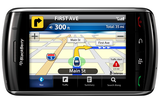
Image Source: http://northrofneutral.wordpress.com
GPS Navigation Units are continually calculating the Distance Between Two Points.
Eg. The Distance from the Car to the next Turn.
This is worked out by using the current Coordinates of the Car, and the known GPS grid map coordinates of the next Intersection where we need to turn.
In this lesson, we show how to work out the Distance between Two Points on the Cartesian Grid, using Pythagoras Theorem.
If you are interested in knowing about How Sat Nav Locates Positions, then watch the following five minute video.
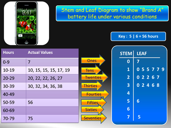
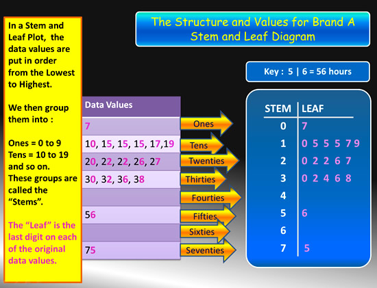
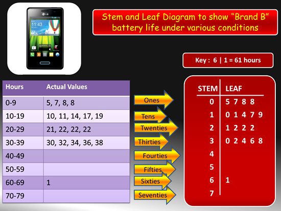
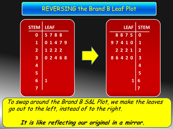
Distance Between Points Using Pythagoras
Let’s work through an example to show how this is done.
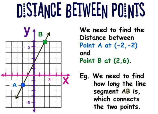
Image Copyright 2013 by Passy’s World of Mathematics
We can measure the “Across” distance and the “Up” distance by counting squares.
This creates a right triangle on our grid, as shown below.
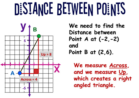
Image Copyright 2013 by Passy’s World of Mathematics
We can apply “Pythagoras Theorem” to the right angled triangle to work out what the distance AB is between the two points.
If you do not know about Pythagoras Theorem for Right Triangles, then see our previous lesson about this at the following link:
http://passyworldofmathematics.com/pythagoras-and-right-triangles/
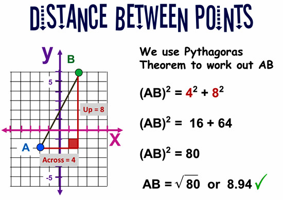
Image Copyright 2013 by Passy’s World of Mathematics
Distance Between Points Formula
Rather than have to draw Pythagoras Trianges onto our graph of the two points, we can develop an Algebra Formula to save us a lot of time and work.
We can subtract coordinate values to work out the “Across” and the “Up”, instead of drawing a graph and counting squares.
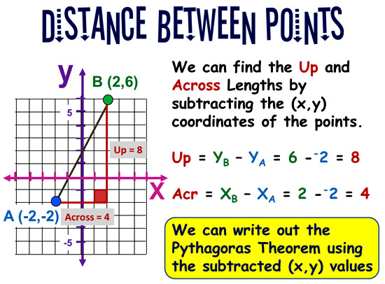
Image Copyright 2013 by Passy’s World of Mathematics
We now substitute our subtracted coordinates expressions: XB – XA and YB – YA into the Pythagoras Theorem, and thereby create an Algebra Formula for the Distance between any two points labelled “A” and “B”.
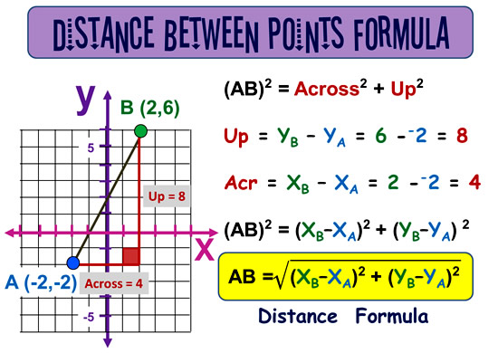
Image Copyright 2013 by Passy’s World of Mathematics
We will do some examples on how to find Distance using the subtracting coordinates Formula later in this lesson, but first we recommend watching the following videos to consolidate the material we have covered so far in this lesson.
Distance Using Pythagoras Video
The following video shows how to find the distance between points using the Pythagoras Theorem.
Pythagoras Theorem is a great way of understanding how the Distance Between Points works; however we believe that people should move on from this to using the Formula Method.
For the Pythagoras method, we need to spend a lot of time manually drawing our points onto a Cartesian grid and forming Right Triangles around them.
However, if we identify the x1,y1 and x2,y2 coordinate values of our points and use these in the Distance Formula, we do not have to draw any graphs at all.
Once mastered, the Distance Formula saves a lot of time, and can even be programmed into computerised apps.
Distance Formula Video
The following video from Spiro at Vivid Maths shows how to do a typical Distance Formula question.
Distance Formula Steps
When asked to find the Distance between two points, label these two points “A” and “B”.
It does not matter which way around they are labelled, as the formula will give the same answer for both scenarios.
It is not necessary to graph the two points on a Cartesian Grid, as the formula only requires the number values of their (x,y) coordinates.
After labelling the two points, follow these working out steps:
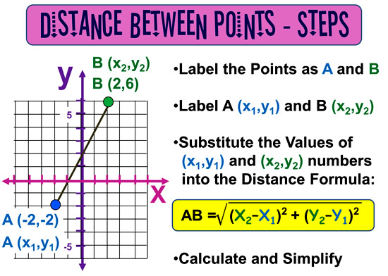
Image Copyright 2013 by Passy’s World of Mathematics
Distance Formula – Example One
Here is an example with the working out steps marked in.
See if you can fill in the blanks and get to the correct answer.
(The fully worked answer is further down the page).
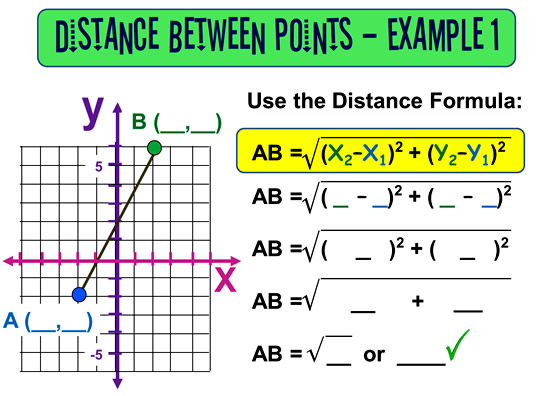
Image Copyright 2013 by Passy’s World of Mathematics
Here is the fully worked solution for Example 1:
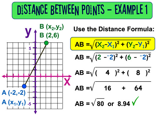
Image Copyright 2013 by Passy’s World of Mathematics
Note that we have labelled the Coordinates (x1,y1) rather than (xA,yA), as “A” is usually called “Point 1”, and “B” is known as “Point 2”.
Distance Formula – Example Two
Here is an example with the working out steps marked in.
See if you can fill in the blanks and get to the correct answer.
(The fully worked answer is further down the page).
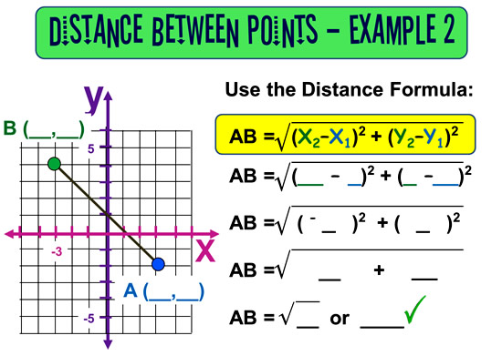
Image Copyright 2013 by Passy’s World of Mathematics
Here is the fully worked solution for Example 2:
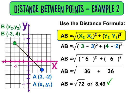
Image Copyright 2013 by Passy’s World of Mathematics
Note that we have labelled the Coordinates (x2,y2) rather than (xB,yB), as “B” is usually called “Point 2”, and “A” is known as “Point 1”.
Remember that it does not matter which way around you label the two points “A” and “B”, as the answer should be the same in both cases.
Note that it is not necessary to draw the points on an X-Y Grid, if the Point Coordinates are given in the question:
eg. If you are given (3,2) and (6,8), then you can simply just work off the x,y coordinate values of these two points.
Eg. It is not necessary to plot these two points onto an X-Y Cartesian Grid.
Distance Formula Calculators
In the Real World, people do not calculate Distance manually like we have done, they use a Calculator App to do it.
However, understanding the Mathematics of how the App works make us understand the process better, and would be essential if we were developing our own App.
The following page has a great Distance Between Points Calculator, which shows full working out steps and answers:
http://ncalculators.com/geometry/length-between-two-points-calculator.htm
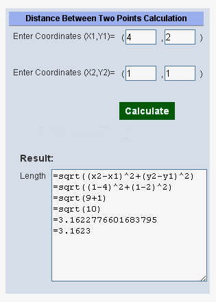
Here is another easy to use Distance Calculator that is on the Web.
You can use this on screen calculator below, right here on this lesson page:
If the on screen calculator does not work then use:
The following web page for this easy to use Distance Calculator:
http://easycalculation.com/analytical/distance.php
Blank X-Y Grid
Here is a blank X-Y Grid you can print out and use for plotting question Points, and working out distances using Pythagoras, or the Distance Formula.
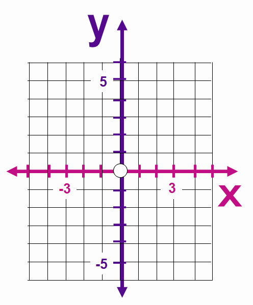
Image Copyright 2013 by Passy’s World of Mathematics
Distance Between Points Worksheets
The following Online PDF Worksheet has a variety of questions with answers provided at the end of the sheet.
Here is another worksheet on Distance Between Points which also has answers at the end of it.
This worksheet is totally over the top and has 900 questions on it!
Just pick about 10 questions to do from it that cover a variety of positive and negative coordinates.
Distance Formula Online Test / Worksheet
Finally if you need any extra practice then try out the online test on the following web page:
http://www.onlinemathlearning.com/distance-formula-worksheet.html
Calculating GPS Distance

Image Source: http://www.ga.gov.au
Because the Earth is not flat, and is a curved surface, calculating the distance between two GPS Coordinates uses more complex mathematical formulas involving spherical trigonometry.
Spherical Trigonometry is an important part of mathematics which people who sail ships at sea, and aircraft pilots need to know. These calculations are done by computer apps in the real world.
However Pilots and Mariners still need to know the maths involved with these calculations, in case the computer or GPS ever breaks down!
The following web page shows some of these formulas, and also supplies the javascript code for programming a calculator for them into a computer.
http://www.movable-type.co.uk/scripts/latlong.html
Related Items
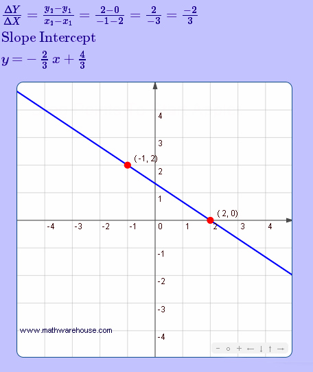
The Cartesian Plane
Plotting Graphs from Horizontal Values Tables
Plotting a Linear Graph using a Rule Equation
Plotting Graphs from T-Tables of Values
Finding Linear Rules
Real World Straight Line Graphs I
Real World Straight Line Graphs II
Subscribe
If you enjoyed this lesson, why not get a free subscription to our website.
You can then receive notifications of new pages directly to your email address.
Go to the subscribe area on the right hand sidebar, fill in your email address and then click the “Subscribe” button.
To find out exactly how free subscription works, click the following link:
If you would like to submit an idea for an article, or be a guest writer on our website, then please email us at the hotmail address shown in the right hand side bar of this page.

If you are a subscriber to Passy’s World of Mathematics, and would like to receive a free PowerPoint version of this lesson, that is 100% free to you as a Subscriber, then email us at the following address:

Please state in your email that you wish to obtain the free subscriber copy of the “Distance Between Points” Powerpoint.
Feel free to link to any of our Lessons, share them on social networking sites, or use them on Learning Management Systems in Schools.
Like Us on Facebook
Our Facebook page has many additional items which are not posted to this website.
These include items of mathematical interest, funny math pictures and cartoons, as well as occassional glimpses into the personal life of “Passy”.
Check it out at the following link:
https://www.facebook.com/PassysWorldOfMathematics
While you are there, LIKE the page so you can receive our FB updates to your Facebook News Feed.
Help Passy’s World Grow
Each day Passy’s World provides hundreds of people with mathematics lessons free of charge.
Help us to maintain this free service and keep it growing.
Donate any amount from $2 upwards through PayPal by clicking the PayPal image below. Thank you!
PayPal does accept Credit Cards, but you will have to supply an email address and password so that PayPal can create a PayPal account for you to process the transaction through. There will be no processing fee charged to you by this action, as PayPal deducts a fee from your donation before it reaches Passy’s World.
Enjoy,
Passy